Click HERE for an interactive tutorial. Scroll to the bottom for animated steps.
Detailed Step-by-Step Tutorial
Add, Change or Link an Image
- Open the page of the website where an image needs to be added, changed or linked.
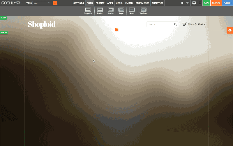
- Either click on an existing image or go to FORMAT tab and drag Image widget to the page.
- When image is selected, go to Settings > APP.

Change
Upload your own image or choose one from Goshly Stock Gallery.

Edit
Use built-in Image Editor to edit the image or apply filters.

Image Link Type
Choose between Image Link, Popout and Hover to define image link behavior.
Image Link
- Existing Pages: link the image to an existing page of the website.
- Online Catalog Pages: link the image to your online catalog.
- URL: specify an external URL to link the image to.
- New window: toggle this option to ON to open the link in a new window.
- Search Engine Title (SEO): enter an SEO friendly Title for the image.

Popout
- Popout: select a popout from the available list (go to Manage to create a new one if none is available).
- Popup Size: select a popout size from the available size list i.e. small, medium, large, custom (specify width and height).
- Insert: click to add popout to the widget.
- Remove: click to remove popout from the widget.
- Manage: click to create and add popouts to popout selection.

Hover
- Select Effect: select an Image mouse hover effect from the available drop down list.
- Rollover Description: enter the rollover description for the hover effect of the image.
- Insert: add rollover description to the hover effect in the image.
- Remove: delete the rollover description in the hover effect of the image.

General Settings
Manage general settings for the selected image.
- Title: enter the title for the image.
- Show as Tooltip: This option allows you to show the title as tooltip. This is the text that appears when you mouse hover on the widget.
- Top: view or edit top margin of the image.
- Left: view or edit left margin of the image.
- Width: view or define the width of the image.

Background
- Color: Choose background color.
- Opacity: Set opacity for the background.
- Image: Enable to use an image as a background.
- Size: Choose background size (i.e. auto, 100%, etc.).
- Position: Set position of the background.
- Repeat: Choose repeat type for the background.

Border
- Color: Choose border color.
- Style: Chose border style.
- Width: Choose the width of the border.
- Radius: Choose border corner radius.

Box Shadow:
- Shadow: Toggle ON to create a shadow for the image.
- H-Shadow: Set horizontal position of the shadow.
- V-Shadow: Set vertical position of the shadow.
- Blur: Set blur value for the shadow.
- Spread: Define how far the shadow spreads.
- Color: Set the color for the shadow.
- Style: Select between inset and outset.

Comments