Click HERE for an interactive tutorial. Scroll to the bottom for animated steps.
Detailed Step-by-Step Tutorial
Add Button
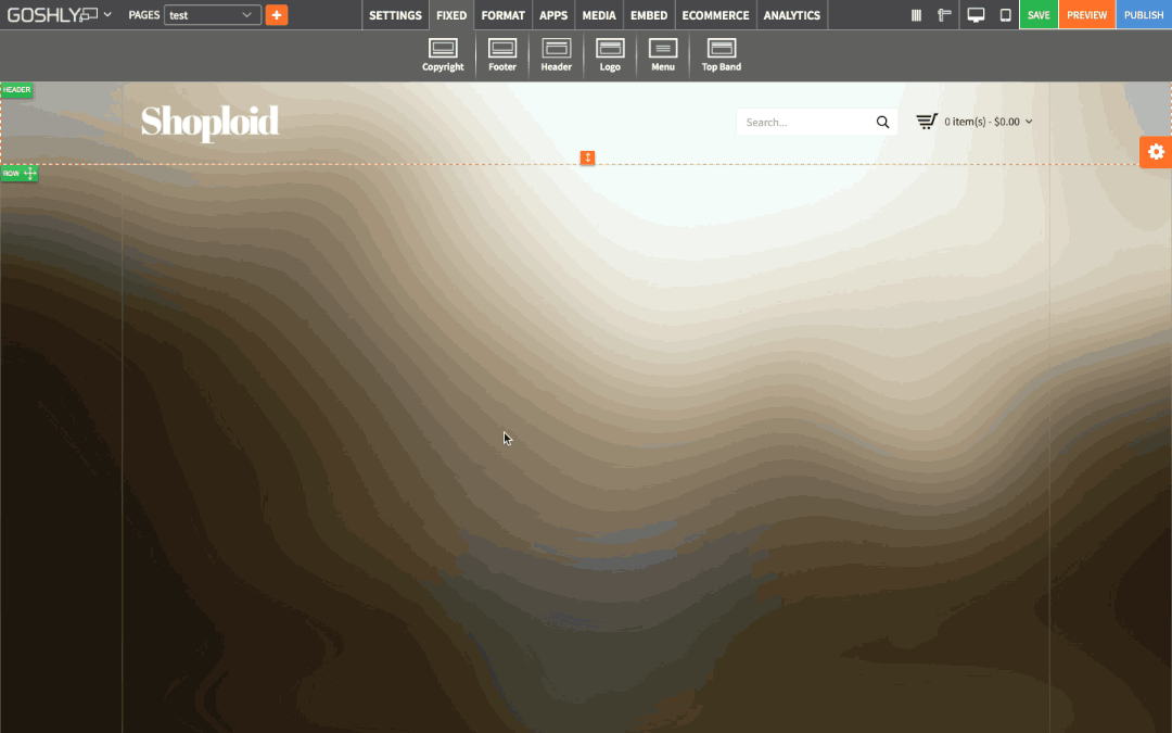
- Go to Format at the top of the page.
- Drag Button widget to an area of the page where you'd like to add it to.

Manage Button
- Double-click on button or highlight it and go to Settings pane > APP
- Button Text: Type the text that will appear on the button.
- Background: Toggle ON to enable and choose background color for the button.
- Opacity: Define opacity of the button.

Border:
- Color: Choose border color.
- Style: Chose border style.
- Width: Choose the width of the border.
- Radius: Choose border corner radius.

Image:
- Image: Enable to use an image as a background.
- Size: Choose background size (i.e. auto, 100%, etc.).
- Position: Set position of the background.
- Repeat: Choose repeat type for the background.

Typography:
- Font Family: Select font family for button text (Times New Roman, Arial, etc.).
- Font size (px): Choose font size for button text (12, 14, 16, etc.).
- Font Style: Choose font style for button text (normal, italic or oblique).
- Font Weight: Choose font weight for button text (normal, bold, etc.).
- Text Color: Choose the color for button text.
- Text Align: Choose text alignment for button text.

Link
- Existing Pages: Link the button to an existing page on your site.
- Online Catalog Pages: Link the button to one of the catalog pages on your site.
- URL: Link the button to an external web-page.
- New Window: Toggle ON to have linked content of the button to open in a new window of the web browser.

General Settings
- Title: Enter the title.
- Show as Tooltip: Show the title as tooltip (text that appears when your mouse hovers over the button).
- Top: Set top margin.
- Left: Set left margin.
- Width: Set the width.

Background:
- Color: Choose background color.
- Opacity: Set opacity for the background.
- Image: Enable to use an image as a background.
- Size: Choose background size (i.e. auto, 100%, etc.).
- Position: Set position of the background.
- Repeat: Choose repeat type for the background.

Border:
- Color: Choose border color.
- Style: Chose border style.
- Width: Choose the width of the border.
- Radius: Choose border corner radius.
Box Shadow:
- Shadow: Toggle ON to create a shadow for the button.
- H-Shadow: Set horizontal position of the shadow.
- V-Shadow: Set vertical position of the shadow.
- Blur: Set blur value for the shadow.
- Spread: Define how far the shadow spreads.
- Color: Set the color for the shadow.
- Style: Select between inset and outset.

how do you link a pdf to this button?