Click HERE for an interactive tutorial. Scroll to the bottom for animated steps.
Detailed Step-by-Step Tutorial
Add Form Builder
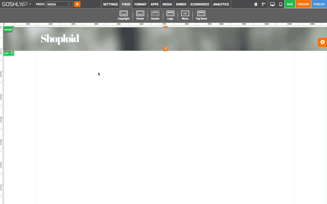
- Go to APPS at the top of the screen.
- Drag Form Builder widget to an area of the page where you'd like to add it to.

- Double-click on the added Form Builder or right-click on it and click Form Builder Settings to reveal the Settings Pane.
- Select Form: Select a form type (i.e. registration form, contact us, etc.).

Manage Forms
Existing forms, if any, are displayed in the table called Form List.
- Edit Form: Edit an existing form.
- View/Fill Form: Preview and test a form.
- View Submissions: View the submissions that used the form.
- Delete: Delete form.

- Click
 to add a new form to the Forms List.
Form Builder
Drag the form fields you need to build your form. Switch between Basic and Advanced tabs for various field types.
Basic:
- Heading: Add a heading to your form.
- Text Box: Add a one-line text field to your form.
- Text Area: Add an expandable text area to your form.
- Dropdown: Add a dropdown menu to your form.
- Radio Button: Add a single-choice selection to your form.
- Check Box: Add a multiple-choice selection to your form.

Advanced:
- Contact Us: Add default contact us form.
- Full Name: Add a full name field to your form.
- Email: Add email field to your form.
- Address: Add Address field to your form.
- Phone: Add a phone number field to your form.
- Birthday Picker: Add a birthday date field to your form.
- Date Picker: Add a date picker to your form.
- Date Range Picker: Add a date range picker to your form.
- Time Picker: Add a time picker to your form.

Form Properties
When a form title is selected, manage the following properties.
- Title: Add title for the form.
- Theme: Select theme for your form.
- Notification Email: Enter the email address where you want the from details to be sent to.
- Confirmation Message: Enter the message that you want to be displayed once the form is submitted.

When an existing form field is selected, manage the properties pertinent to that field
Form Settings
- Theme: Choose a theme for the form.
- Notification Email: Enter the email address where you want the from details to be sent to.
- Confirmation Message: Enter the message that you want to be displayed once the form is submitted.
- Auto-response Email: Toggle ON to enable auto response email when a form is submitted.
- Auto-Response Email Msg: Create the message to be sent as an auto response email when a form is submitted.

General Settings
- Title: Enter the title.
- Show as Tooltip: Show the title as tooltip (text that appears when your mouse hovers over the blog).
- Top: Set top margin.
- Left: Set left margin.
- Width: Set the width.

Background:
- Color: Choose background color.
- Opacity: Set opacity for the background.
- Image: Enable to use an image as a background.
- Size: Choose background size (i.e. auto, 100%, etc.).
- Position: Set position of the background.
- Repeat: Choose repeat type for the background.

Border:
- Color: Choose border color.
- Style: Chose border style.
- Width: Choose the width of the border.
- Radius: Choose border corner radius.

Box Shadow:
- Shadow: Toggle ON to create a shadow for the blog.
- H-Shadow: Set horizontal position of the shadow.
- V-Shadow: Set vertical position of the shadow.
- Blur: Set blur value for the shadow.
- Spread: Define how far the shadow spreads.
- Color: Set the color for the shadow.
- Style: Select between inset and outset.

Comments