Click HERE for an interactive tutorial. Scroll to the bottom for animated steps.
Detailed Step-by-Step Tutorial
Add Banner
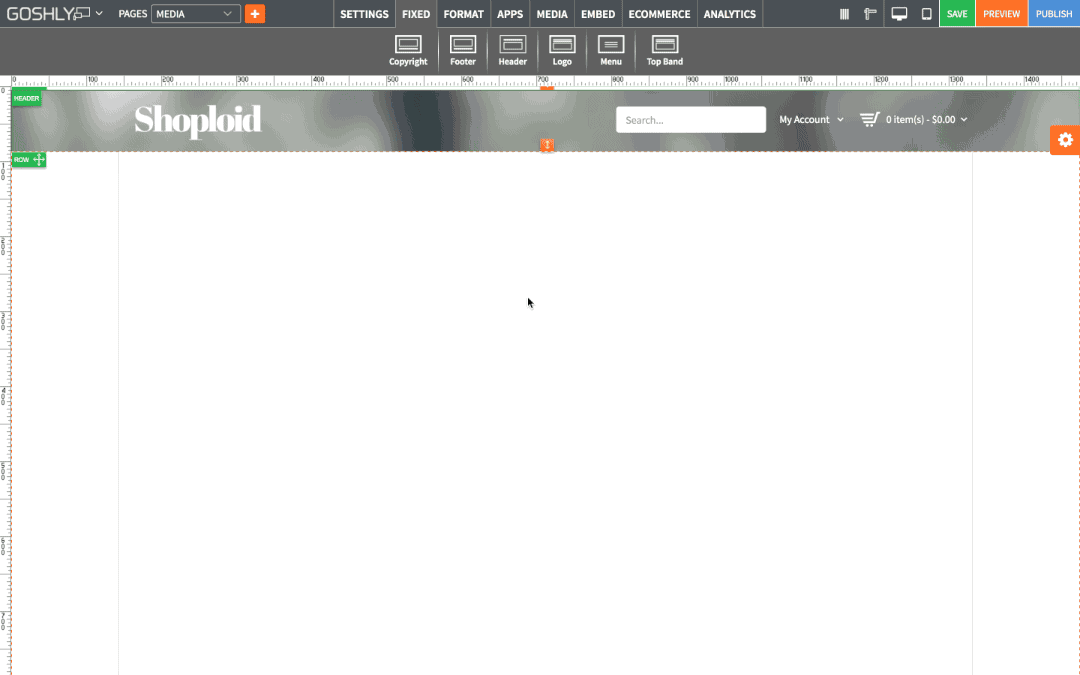
- Go to APPS at the top of the screen.
- Drag Banner widget to an area of the page where you'd like to add it to.

- Double-click on Banner or right-click to go to Banner Settings in the Settings Pane.
- Select Banner: Choose a banner from your selection. If you haven't created any banners yet, proceed to Manage Slides to create a banner.

Edit/Advanced Settings
- Click Create New Banner to create a new banner.

- Banner Title: Enter banner title.
- Responsive: Choose to make the banner responsive.
- Full Width: Choose to make the banner occupy the full width of the page.
- Full Screen: Choose to make the banner occupy full screen.
- Width (px): Enter the banner width.
- Height (px): Enter the banner height.
- Click Save Banner.

Manage Banner
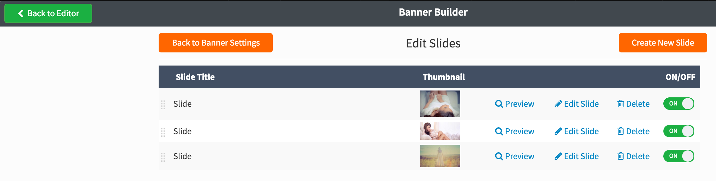
- Create New Slide: Click to add a new slide to the banner.
- Preview: Click to preview the slide effect and caption effect.
- Edit Slide: This option allows you to change image slide settings and layer settings.
Slide Settings
- Bg Image: Add or edit the background image for the slide.
- Slide Title: Enter title for the slide.
- Slide Transition: Select a transition effect for the slide from the dropdown list.
- Slide Delay (milliseconds): Set the length of the delay effect (in milliseconds).
- Enable Link: Toggle ON to add a link to the slide.
- Slide Link: If Enable Link is toggled ON, enter the url for the link.
- Link Open In: If Enable Link is toggled ON, choose whether the link will open in same or new window.

- Add Layer: Add a layer over slide background image, either as a text, image, or video.
- Layer Text: Add caption to the layer.
- Font Family: Select font family for the layer text.

- Font Size: Set font size for the layer text with the slider.
- Font Weight: Select font weight for the layer text.
- Font Style: Select font style for the layer text.
- Font Color: Choose font color for the layer text.
- Background Color: Choose background color for the layer text.

- Layer Link: Add a URL if you'd like to link layer text to another page.
- Link Open In: If the layer text linked to another page, choose whether the link will open in same or new window.
- Animation: Choose animation effect for the layer text.
- Easing: Choose layer text easing effect.
- Speed (ms): Set speed of animation effect (in milliseconds).

- Click Update to save the slide and layer settings.
Banner Settings
Primary
- Banner Layout: Choose responsive, full width, or full screen layout.
- Height(px): For responsive or full width layout, enter the heigh in pixels.
- Width(px): For responsive layout enter width in pixels.
- Transition: Select transition type from the dropdown list.
- Banner Title: Enter title for the banner.
- Current Slide:
- Delay (ms): Enter the delay between slides (in milliseconds)
- Randomize: Toggle ON to randomize the slides.
- Lazy Load:
- Touch Enabled: Toggle ON to enable touch gestures on the banner when website is viewed on a touchscreen.
- Hide Caption Resolution (px):
- Pause On Hover: Toggle ON to pause slides when mouse hovers over the banner.
- Play Once: Toggle ON to only play all slides once.
- Shadow Type: Select a shadow type, if any, from the dropdown list.

Navigation
- Navigation Type: Select the slide navigation type from the dropdown list.
- Navigation Style: Select navigation style from the dropdown list.
- Show Buttons on Hover: Toggle ON to show navigation buttons when mouse hovers over the banner.
- Horizontal Offset (px): Set horizontal offset with a slider.
- Vertical Offset (px): Set vertical offset with a slider.
- Timer: Toggle ON to enable a horizontal progress bar indicating the duration of a slide.
- Timer Align: If timer is toggled ON, select the alignment for the timer (top or bottom).

Thumbnails
- Show Thumbnails: Toggle ON to show slide thumbnails.
- Thumb Width (px): If slide thumbnails are enabled, set the their width (in pixels).
- Thumb Height (px): If slide thumbnails are enabled, set their height (in pixels).

General Settings
- Title: Enter the title.
- Show as Tooltip: Show the title as tooltip (text that appears when your mouse hovers over the banner).
- Top: Set top margin.
- Left: Set left margin.
- Width: Set the width.

Background:
- Color: Choose background color.
- Opacity: Set opacity for the background.
- Image: Enable to use an image as a background.
- Size: Choose background size (i.e. auto, 100%, etc.).
- Position: Set position of the background.
- Repeat: Choose repeat type for the background.

Border:
- Color: Choose border color.
- Style: Chose border style.
- Width: Choose the width of the border.
- Radius: Choose border corner radius.

Box Shadow:
- Shadow: Toggle ON to create a shadow for the heading.
- H-Shadow: Set horizontal position of the shadow.
- V-Shadow: Set vertical position of the shadow.
- Blur: Set blur value for the shadow.
- Spread: Define how far the shadow spreads.
- Color: Set the color for the shadow.
- Style: Select between inset and outset.

Comments