
Click HERE for an interactive tutorial. Scroll to the bottom for animated steps.
Detailed Step-by-Step Tutorial
Add Multi-Layout Portfolio
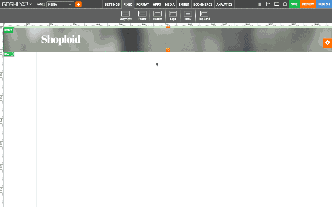
- Go to MEDIA at the top of the screen.
- Drag Multi-Layout Portfolio widget to an area of the page where you'd like to add it to.

- Double-click on Multi-Layout Portfolio or highlight it and go to Settings pane > APP.
- Select Gallery: If any galleries for multi-layout portfolio have been previously created, select one from the dropdown list.

Create Portfolio Gallery
- Manage Portfolio Gallery: Click to create a new gallery, or manage existing ones.

Under Create Portfolio tab:
- Portfolio Name: Enter name for the new portfolio gallery.
- SAVE: Click to save the new gallery.

- Add Image: Click to add images to the gallery.
- Add Video: Click to add videos to the gallery.
- Media List: Click to view/rearrange added images and videos.
Portfolio Settings
Once you create a portfolio gallery, you can choose portfolio settings in the Settings Pane.

- Portfolio Settings: Click to manage portfolio settings, such as gallery theme, category/title, layout, typography, and effects.

- Gallery Theme: Choose a theme for the gallery portfolio.

Category/Titles
- Filter Categories: Toggle ON to filter gallery categories.
- Show Title: Toggle ON to show image titles.
- Open More Content: Toggle ON to open more content on a click.
- Category Effect: Select a category effect from the dropdown list.

Layout
- Horizontal Spacing: Set horizontal spacing between images.
- Vertical Spacing: Set vertical spacing between images.
- Open in Lightbox: Toggle ON to open images in lightbox on click.
- Single Pane Inline: Select position for the single pane inline.
- Link Page: Toggle ON to include a link.
- Sticky Navigation: Toggle ON to enable sticky navigation.
- Page Animation: Select animation type for when a mouse hovers over an image.
- In Focus: Toggle ON
- Filters Deeplinking:
- Grid Adjustment: Select grid adjustment type from the dropdown list.

Buttons and Effects
- Background Color: Choose background color.
- Bg Transparent: Toggle ON to make background transparent.
- Hover Transparent: Toggle ON to make hover effect transparent.
- Hover Color: Choose color for the hover effect.
- Border Color: Set color for the border.
- Caption Effect: Select an effect for captions from the dropdown list.
- Loading Effect: Select an effect for loading from the dropdown list.
- Display Speed (ms): Set display speed in milliseconds.
- Text Transform: Select formatting for text transform.
- Rollover Color: Set color for rollover.
- Main Title Color: Set color for main title.
- Sub Title Color: Set color for sub title.

Button Typography
- Show Info Button: Toggle ON to show info button.
- Info Button Label: Enter info button label.
- Show View Button: Toggle ON to show view button.
- View Button Label: Enter view button label.
- Font Family: Select font family from the dropdown list.
- Button Text Color: Set color for the button text.
- Button Height: Set button height with a slider.
- Button Font Size: Set button font size with a slider.
- Button Width: Set button width with a slider.
- Button Border: Set button border with a slider.
- Font Style: Select font style from the dropdown list.
- Font Weight: Select font weight from the dropdown list.

Title Typography
- Main Title Font: Select main title font from the dropdown list.
- Sub Title Font: Select sub-title font form the dropdown list.
- Main Title Size: Set main title size with a slider.
- Sub Title Size: Set sub-title size with a slider.
- Main Title Style: Select main title style from the dropdown list.
- Sub Title Style: Select sub-title style from the dropdown list.
- Main Title Weight: Select main title weight from the dropdown list.
- Sub Title Weight: Select sub-title weight from the dropdown list.

General Settings
- Title: Enter the title.
- Show as Tooltip: Show the title as tooltip (text that appears when your mouse hovers over the gallery portfolio).
- Top: Set top margin.
- Left: Set left margin.
- Width: Set the width.
- Fixed Width: Toggle ON to fix gallery portfolio's width.

Background
- Color: Choose background color.
- Opacity: Set opacity for the background.
- Image: Enable to use an image as a background.
- Size: Choose background size (i.e. auto, 100%, etc.).
- Position: Set position of the background.
- Repeat: Choose repeat type for the background.

Border
- Color: Choose border color.
- Style: Chose border style.
- Width: Choose the width of the border.
- Radius: Choose border corner radius.

Box Shadow
- Shadow: Toggle ON to create a shadow for the contact form.
- H-Shadow: Set horizontal position of the shadow.
- V-Shadow: Set vertical position of the shadow.
- Blur: Set blur value for the shadow.
- Spread: Define how far the shadow spreads.
- Color: Set the color for the shadow.
- Style: Select between inset and outset.

Comments