
Click HERE for an interactive tutorial. Scroll to the bottom for animated steps.
Detailed Step-by-Step Tutorial
Add Inline Expanding Thumbnail
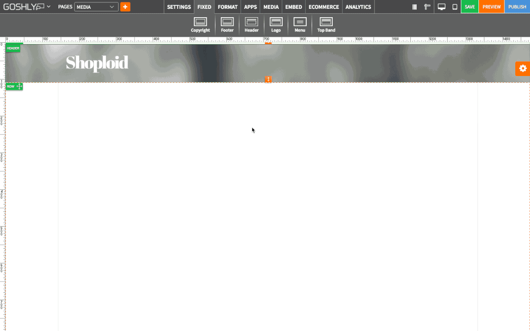
- Go to MEDIA at the top of the screen.
- Drag Inline Expanding Thumbnail widget to an area of the page where you'd like to add it to.

- Double-click on Inline Expanding Thumbnail or highlight it and go to Settings pane > APP.

Create New Gallery
If thumbnail galleries have been previously created, select one from the dropdown list, otherwise create a new one.
- Create New Gallery: Click to create a new gallery.
- Gallery Name: Give a new gallery a name.
- Click Save.

- Manage Slides: Click to add slides to the thumbnail gallery.

- Upload from Image Gallery: Use the option to choose photos from Image Gallery for the slides.
- AND/OR
- Upload from Computer: Use the option to upload photos from your computer for the slides.
You can drag uploaded photos to re-arrange them, click Edit button to use image editor, or annotate button to add image name, description, and url.
- Click Save.

Gallery Settings
- Gallery Name: Give gallery a name.
- Show Expander: Toggle ON to allow image name and description to show if an image is clicked (image name and description can be added/edited in Manage Gallery > Manage Slides).
- Show Link: Toggle ON to show urls of the images(image url can be added/edited in Manage Gallery > Manage Slides).
- Link Label: Create a link label if show link option was toggled ON.
- Image Size: Choose thumbnail image size from the dropdown.
- Thumbnail Spacing: Adjust thumbnail spacing with the slider.

General Settings
- Title: Enter the title.
- Show as Tooltip: Show the title as tooltip (text that appears when your mouse hovers over the thumbnail gallery).
- Top: Set top margin.
- Left: Set left margin.
- Width: Set the width.
- Fixed Width: Toggle ON to fix audio gallery's width.

Background
- Color: Choose background color.
- Opacity: Set opacity for the background.
- Image: Enable to use an image as a background.
- Size: Choose background size (i.e. auto, 100%, etc.).
- Position: Set position of the background.
- Repeat: Choose repeat type for the background.

Border
- Color: Choose border color.
- Style: Chose border style.
- Width: Choose the width of the border.
- Radius: Choose border corner radius.

Box Shadow
- Shadow: Toggle ON to create a shadow for the contact form.
- H-Shadow: Set horizontal position of the shadow.
- V-Shadow: Set vertical position of the shadow.
- Blur: Set blur value for the shadow.
- Spread: Define how far the shadow spreads.
- Color: Set the color for the shadow.
- Style: Select between inset and outset.

Comments